
The Influence of Colour Psychology in Interior Design
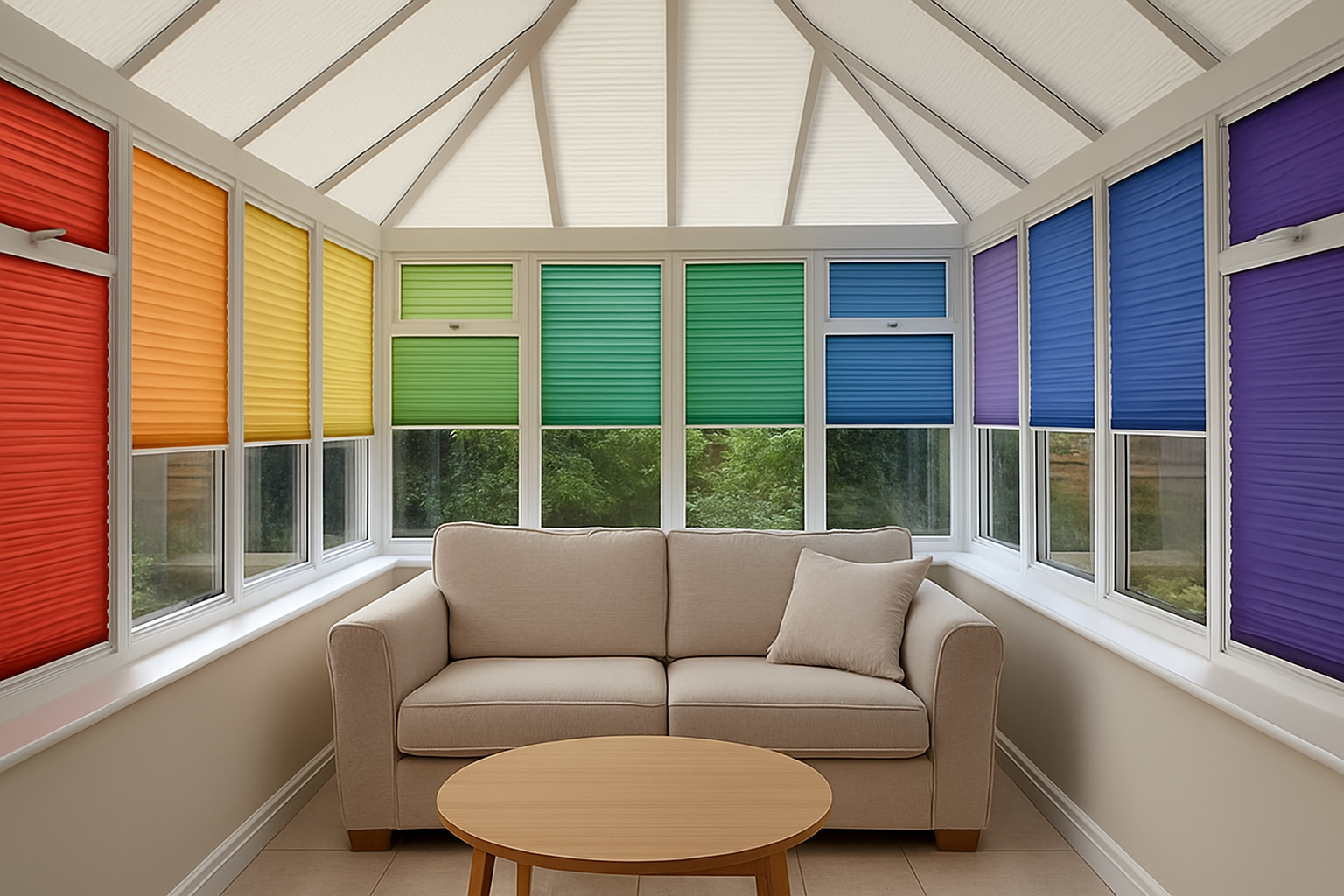
The colours we choose for our living spaces significantly affect our mood, behaviour, and sense of overall well-being. In conservatories, colour becomes especially influential due to the abundance of natural light which amplifies its presence and emotional impact.
Using colour psychology in conservatory blinds goes beyond style—it becomes a strategic design decision. Choosing the right hue can create a sanctuary for relaxation, stimulate productivity, or offer a welcoming space for guests. Impress Blinds offers a range of customisable options, allowing homeowners to tailor their spaces through both design and emotion.
Calming Neutrals for a Serene Retreat
Neutral tones in conservatory blinds are the cornerstone for achieving tranquillity and timeless elegance. From soft off-whites to muted greys, these shades reflect natural daylight beautifully, giving your conservatory an airy, open quality. Neutrals are perfect for those looking to create a peaceful lifestyle environment where one can unwind from the hustle and bustle of the day.
They are particularly effective in spaces that double as reading nooks or home offices. Light beige and pale taupe encourage feelings of calmness and stability, a subtle psychological cue to the mind to relax. These palettes also work wonderfully with wooden floors or natural furnishings, harmonising the space without overwhelming the senses.
A practical benefit of neutrals is their versatility across varying seasons and trends. Whether your conservatory serves as a sunroom or an occasional dining area, neutral conservatory blinds act as a seamless backdrop for different decor themes. Their understated elegance resonates with minimalist and classic interior styles alike.
By eliminating visual clutter and enhancing light diffusion, these colours help modulate temperature perception as well—making the space feel cooler in summer and warmer in winter. For these reasons, neutral-toned blinds are a truly adaptive choice for long-term comfort and colour harmony.
Energetic Shades for Social and Functional Spaces
Bright colours like sunny yellows, striking oranges and lively reds inject life and vibrancy into your conservatory. These shades stimulate positivity and social interaction, making them perfect for spaces intended for gatherings, dining, or productivity. Their energising influence on mood is rooted in psychological principles, where warm tones increase sensory stimulation and activate cheerful emotions.
If your conservatory acts as a shared family room or entertainment hub, blinds in these colours can enhance the room’s lively dynamic. Yellows represent optimism and spontaneity, while reds symbolise passion and excitement. These characteristics are ideal for making your conservatory an emotionally positive extension of the home.
Beyond aesthetics, brightness has a role in light control. Vivid blinds often provide optimal light filtration, softening intense sunshine without dulling the room. This is particularly useful during high summer when natural light can become overwhelming. With their cheerful character and practical benefits, vibrant blinds strike the right balance for multifunctional conservatorial settings.
To maximise the functional impact of bold hues, consider pairing them with crisp furniture lines or monochrome accents. The interplay between exuberant colour and clean design ensures your conservatory remains invigorating without visual chaos. The team at Impress Blinds can guide you in choosing the right balance of colour and texture for your chosen purpose.
Using Cool Tones to Promote Clarity and Focus
Cool colour palettes—such as blues, greens and purples—are ideal for the conservatory used as a workspace or a personal retreat. These colours have calming undertones and are proven to reduce anxiety while improving mental clarity. Cool hues are not just visually soothing but are beneficial for prolonged focus or mindful living.
Shades of blue, especially softer sky tones, tend to invoke feelings of dependability and logic. They are perfect for conservatories that serve as home study areas or remote work environments. Similarly, natural greens bring a restorative sense of balance and vitality, reflecting the outside foliage and reconnecting the occupants with nature—ideal for indoor gardens or hobby areas.
These colours also pair effortlessly with other cool or neutral design elements. Incorporating metal fixtures, glass tables or white upholstery bridges style coherence across the space. A blinds design with these colours works best with minimalistic or Scandinavian interior approaches, amplifying the serenity these shades represent.
Maintenance-wise, they tend to resist visual wear over time, making them a practical choice for homeowners aiming for longevity. For discerning homeowners seeking an elevating visual and emotional tone, Impress Blinds offers cool-toned ranges in options like Roller or Pleated Blinds, which align beautifully with the needs of both professional and retreat-minded conservatory users.
The Emotional Warmth of Earth Tones
Earthy tones resonate with comfort, grounding and a sense of natural ease. These colours evoke familiarity, and when used in conservatory blinds, they transform the glassy expanse into a warm and inviting part of the home. Think of mellow browns, terracotta, clay, and soft ochres—they warm the space both visually and emotionally.
Such colours complement biophilic design, a trend that prioritises a stronger human-nature connection. When integrated into conservatories—already a bridge between indoors and outdoors—earth tones amplify the natural essence of the space. Blinds in these shades coordinate effortlessly with indoor plants, rustic decor and wooden furniture.
In terms of texture, earth tones work particularly well in fabrics like linen or textured weaves, often found in Roman or Day and Night Blinds. These materials help provide additional depth without compromising light control. From a psychological perspective, these shades foster a nurturing environment—ideal for families, relaxation zones or casual evenings with friends.
Earth tones also have the advantage of being forgiving to everyday dust and wear—making them low-maintenance yet stylish choices. They blend organically across various conservatory styles, whether modern or traditional. By harmonising nature’s palette with human comfort, earthy blinds provide tonal warmth that enriches everyday living.
Monochrome and Greyscale for Contemporary Elegance
Monochrome palettes, including blacks, whites, and varying greys, offer sharp sophistication to conservatory spaces. These colours are ideal for modern homes seeking a streamlined, polished appearance. The psychological impact leans towards professionalism, maturity, and clarity.
Grey, often considered a neutral, carries a sense of compromise and balance. It blends the assured authority of black with the simplicity and illumination of white. In conservatory settings where minimalism and contrast are key, grey becomes a bridging hue that nurtures visual softness and design authority simultaneously.
Black-and-white blinds are particularly suited for homes with large conservatories used for stylish entertaining or as formal lounges. These designs often contrast well with metal accents, polished flooring and glass decor. The resulting aesthetic is clean, dramatic, and undeniably elegant.
When applied correctly, monochrome blinds also help regulate perceived space. Vertical blinds in silver or slate tones can elongate windows, heightening visual dimensions and creating a sleeker outline of the space. For customers wanting to keep interiors visually structured while accommodating bold shapes or angular architecture, options like Vertical Blinds in these shades provide a perfect fit.
How to Choose the Right Colour for Your Conservatory Blinds
Selecting the ideal colour isn’t just a style preference—it’s about harmonising the function of the space with the experience you want to create. Before choosing, homeowners should evaluate what emotional response they want the conservatory to elicit. Is it relaxation? Energy? Focus? Or flexible utility?
Follow these considerations when deciding on colour:
- Purpose of the room: Match the mood with intended use—calming tones for reading, bright tones for socialising.
- Time of use: Daytime versus evening use affects how natural and artificial light interacts with colour.
- Window orientation: South-facing conservatories get more light; warmer shades may feel overpowering without balance.
- Existing décor: Colour needs to complement flooring, walls and furnishings.
- Material of blinds: Some materials absorb or reflect light differently, affecting how the colour is perceived.
With Impress Blinds offering such an extensive variety in styles like Conservatory Blinds, homeowners can tailor their selections not just to match their decor but also their lifestyle. Colour, in this context, becomes both functional and symbolic.