

Understanding the Role of Colour in Interior Design
The colour of your blinds can significantly influence the ambience of a room. When choosing metal Venetian blinds, consider not just practicality but how the colour complements your existing décor.
The right shade can either blend seamlessly or provide contrast to make a design statement. Colour is not merely aesthetic; it also affects mood, light reflection, and the perception of space within your home. For instance, lighter colours create a sense of openness and airiness, ideal for smaller or darker spaces, while darker tones can introduce warmth and sophistication but may make a room feel smaller. Choosing wisely can thus enhance both visual appeal and functionality.
A harmonious colour palette across your walls, furniture, and furnishings contributes to a cohesive look. Matching or complementing blind colours to furniture sets or wall paints can help avoid visual dissonance. Additionally, a consistent colour tone throughout various rooms in your home ensures a better flow and makes your home look thoughtfully designed. For example, using soft grey blinds in a home styled with Scandinavian décor supports a relaxing and minimalistic aesthetic.
The finish on your metal Venetian blinds can also alter their visual impact. Glossy or matte finishes absorb and reflect light differently. A high-gloss white blind can amplify natural light and brighten up your interiors, whereas a matte charcoal grey may provide a more industrial, gritty feel, especially in urban homes. Think carefully about the lighting conditions when choosing your blind’s tone and finish.
Colour psychology plays a subtle role here as well. Blues suggest tranquility, perfect for bedrooms or private spaces, while bolder tones like red can stimulate energy, making them suitable for kitchens or dining areas. Neutral colours such as beige, taupe or grey offer timeless elegance and adapt well to changing décor trends over time. All these nuances make colour selection a vital part of investing in [metal Venetian blinds](https://www.impressblinds.co.uk/metal-venetian.php).
Selecting Colours Based on Room Use and Function
Every room in your home serves a distinct purpose, and the colour of your metal Venetian blinds should reflect this functionality. Whether you’re seeking tranquillity, productivity or entertainment, there’s a suitable shade to support your room’s role.
For living rooms and lounges, aim for warm tans, greys and creams which help create a calm and inviting atmosphere. These tones blend effortlessly with most interior styles while enhancing natural light. If your walls are already light in tone, a slightly darker blind adds subtle contrast without diminishing brightness. Conversely, if your space is bold and colourful, a neutral blind offers visual balance and lets your furnishings stand out.
In kitchens, opt for blinds that are easy to clean and pair well with stainless steel appliances or bright cabinetry. Brushed aluminium or light grey metal Venetian blinds are popular for contemporary kitchens because they reflect light and have a sleek, polished feel. These colours also resist the look of fingerprints and smudges better than darker tones, maintaining a cleaner appearance day-to-day.
Bedrooms, especially those used for rest and unwinding, benefit from calm, soothing tones. Soft blues, muted greens or gentle greys can foster peace and tranquillity. Whether paired with deep navy feature walls or simple white themes, metal Venetian blinds in these shades allow you to customise how light enters without disrupting the room’s serenity.
Home offices and study areas often benefit from utilising shades that support focus and productivity. Neutral greys, pastel blues or even monochrome blacks can establish a professional ambiance, especially in spaces used for remote work. These tones blend well with minimalist and industrial décor themes, reinforcing a sleek and functional setup.
Colour Themes and Trends: Staying Timeless or Going Bold
When it comes to metal Venetian blinds, the choice between safe, timeless colours and bold, statement-making hues is a matter of personal preference and room purpose. But which works best where?
Timeless tones such as white, black, grey, and beige continue to be classic choices. These colours offer the flexibility to evolve your home décor over time without needing to change the blinds. Light grey and warm neutrals, in particular, remain on-trend due to their ability to work well with earthy tones, natural textures, and pastel accents. These shades convey understated elegance that adapts well across seasons and shifting interior trends.
Bold colours, on the other hand, require more commitment. Electric blue, teal, deep red, or forest green can inject character into any room. These eye-catching hues work well in contemporary or artistic interiors that embrace colour playfulness. Bedrooms, studios, or modern kitchens can serve as great canvases for experimenting with these striking tones. However, be sure to balance them with neutral walls or furnishings to prevent visual overwhelm.
Interestingly, metallic finishes like bronze, copper, and brushed steel are becoming increasingly popular. These tones work beautifully in urban lofts and industrial-inspired designs. Not only are they functional and durable, but they also bring added depth and texture to a room, especially when paired with wooden floors or exposed brick walls.
For homeowners seeking a middle ground, dual-tone blinds or layering with other window treatments can create interest without overpowering the room. These flexible solutions allow for experimentation while retaining balance. For example, pairing neutral metal Venetian blinds with bold [vertical blinds](https://www.impressblinds.co.uk/vertical-blinds.php) in the same tone family can enhance style and functionality simultaneously.
Coordinating Metal Venetian Blinds with Existing Decor
Harmonising your blinds with your current interior décor is essential in achieving a polished look. Mismatched colours can disrupt the visual rhythm of a space, making it feel cluttered or incomplete.
To achieve cohesion, observe the dominant tones in your space. This includes furniture, flooring, wall paint, and soft décor items like cushions or rugs. If you already have earthy browns and wooden tones, consider metal Venetian blinds in soft bronze or beige to complement the warmth. If the décor leans towards monochrome or modern minimalist, silver or slate grey metals can amplify that aesthetic seamlessly.
Textures and finishes also play key roles. A matte black blind might pair perfectly with matte-finished cabinets or black photo frames, creating repetition and rhythm in the design. In contrast, high-gloss silver blinds complement kitchen accessories like chrome faucets or appliances, bringing a uniform sleekness.
For eclectic or contemporary homes featuring varied textures and colours, stick to versatile, neutral blinds that offer flexibility. These allow you to update furniture or accessories in the future without clashing. For instance, a pewter-toned metal blind is subtle enough to blend across varying colour palettes without drawing too much attention. It acts as a stabilising element in more expressive spaces.
Blinds positioned next to key design elements like headboards, worktops or feature walls should consider those adjacent colours carefully. By echoing or complementing these tones, even your window coverings can contribute to a space that feels refined and cohesive. This approach not only maintains design consistency but enhances property value by portraying your house as carefully curated.
Using Contrast to Highlight or Neutralise
Strategic use of contrast can either highlight the blinds as a focal point or allow them to blend into the background. Understanding this technique can help you achieve the desired visual effect in your space.
If your goal is to make the windows stand out, choose blinds in a contrasting colour to the surrounding walls. For instance, light walls with matte black or navy blinds emphasise the structure of the window and draw the eye. This is particularly effective in modern and minimal interiors where architectural elements are central to the design ethos. It adds dimension and drama without overwhelming the space.
On the other hand, for a subtle, blended effect, opt for blinds that match either your walls or window frames. This is ideal for small rooms or when the focus should remain on other design features like artwork, statement furniture, or textured walls. For example, white blinds on off-white walls allow soft natural light to diffuse smoothly without drawing attention away from the room’s centrepieces.
The benefit of metal Venetian blinds is their sleek, contemporary design that can either support subtle integration or bold statement-making. It’s important, however, to consider the architectural style of the room before introducing contrast. In traditional or character homes, subtle and harmonious colour combinations usually feel more appropriate, while high contrast tends to thrive in modern or eclectic designs.
Contrast also relates to function—dark blinds block more light and can offer greater privacy, which might influence your choice based on room usage. Light blinds reflect more ambient light, brightening spaces like kitchens or hallways. This makes choosing the right colour for your blinds not just an aesthetic concern but a practical one, too.
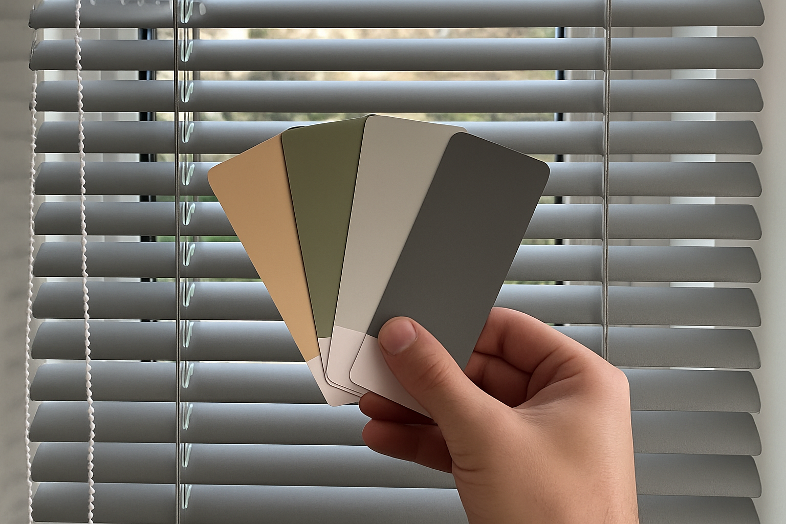
Popular Colour Recommendations for UK Homes
Some colours prove consistently popular with UK homeowners thanks to their versatility and ability to complement classic British interiors. Here’s a summary of shades often chosen to balance style, practicality and timeless appeal:
- Soft Grey: Ideal for both traditional and modern spaces; blends well with white, navy, or mustard tones.
- Brushed Silver: A smart, professional look suitable for kitchens or home offices.
- Charcoal: A deeper, dramatic tone that works well in contemporary and loft-style homes.
- Ivory or Cream: A go-to for period homes or rustic interiors where warmth is key.
- Pewter: Offers neutrality with character, perfect for layered décor schemes.
- Matte Black: Bold,