
Earthy Tones Making a Natural Comeback
In 2025, earthy tones are once again finding their place in homes across the UK. These natural hues create calming interiors and complement a variety of design styles effortlessly.
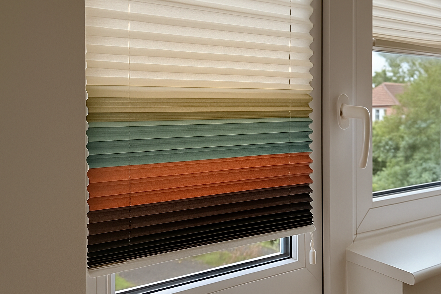
Soft browns, sand colours, moss greens, and muted terracottas are dominating the colour charts for pleated blinds. Drawing inspiration from the outdoors, these shades work particularly well in living rooms, bedrooms, and conservatories where a cosy yet stylish aesthetic is desired. Homeowners are increasingly seeking finishes that evoke a sense of tranquillity, and earthy colours do just that, offering visual comfort with minimal effort. The tactile appeal of pleated blinds pairs wonderfully with these warm hues, providing both texture and depth to any window setting.
If you’re updating your blinds to reflect this year’s trends, the earthy palette allows you to introduce subtle sophistication. Impress Blinds offers an extensive range of pleated blinds that easily integrate these tones, aligning with natural wood furnishings, neutral walls, and biophilic-themed interiors. Whether you live in a countryside cottage or a modern Manchester flat, earthy colours can enhance the homely feel in any environment.
Deep Blues and Lagoon Shades: Ocean-Inspired Vibes
Rich, oceanic blues are emerging as standout colours for pleated blinds in 2025. This trend embraces serene and luxurious aesthetics guaranteed to transform your space.
The popularity of lagoon blues, navy tones, and seafoam green isn’t accidental—they carry a calming and fluid presence that mimics the serenity of coastal settings. Whether paired with white walls or wooden floors, these marine-inspired colours act as accents or centrepieces without overwhelming the space. This style particularly suits conservatories and bedrooms, giving rooms a peaceful atmosphere filled with character.
These shades also complement a broad palette of materials, including brushed metals and lighter wood tones, often found in furnishings and trims. By choosing Impress Blinds, you’ll find a curated range of pleated blind fabrics in deep blue and aqua variations, each made for optimal light filtering and privacy. Consider pairing these blinds with decor focusing on sea-inspired motifs—shells, driftwood frames, or even nautical textiles—for a cohesive interior look.
Moreover, this palette fits well into UK homes aiming for a Scandinavian or coastal English cottage style. Whether your interiors lean traditional or contemporary, this colour family offers timeless appeal and elevates natural lighting beautifully throughout the day.
Greige, Taupe, and Stone Shades for Minimalist Interiors
Minimalism continues to thrive in 2025, with greige, taupe, and stone colours at the forefront of pleated blind design. These hues offer understated elegance and versatility in equal measure.
Perfect for those desiring a clutter-free and contemporary interior, these soft neutrals create spaces that feel open, light, and airier. More than just safe colour options, greige and stone carry subtle temperature shifts that can warm up or cool off a room depending on the direction of your light sources. Pleated blinds in these tones help reduce visual noise without compromising on style or functionality.
With UK homeowners favouring neutral backdrops and multi-use open spaces, these shades enable flexibility in décor execution. Whether you’re switching out cushions, throwing in pops of colour, or layering textures through carpets and throws, these blinds won’t conflict with your palette. They also work beautifully in compact flats or larger homes where light manipulation is key throughout different seasons.
Additionally, Impress Blinds’ made-to-measure pleated options in these tones allow precise control over light levels and privacy, making them a modern yet timeless solution. If you already enjoy roller blinds in neutral tones, pleated styles are the perfect complementary upgrade.
When installed in a Perfect Fit frame, these colours offer maximum integration into the window design, further enhancing the minimalist appeal. The smooth transition between window frame and blind fabric appears seamless, perfect for modern kitchens, lounges, and open-plan living rooms.
Sunset-Inspired Hues Adding Warmth and Energy
For those looking to infuse some richness and vibrance into their living spaces, 2025 welcomes sunset-inspired hues. Think coral, rust, muted maroon, and dusky reds.
These colours bring a glowing mood to interiors, ideal for capturing attention without being overly bold. Used in pleated blinds, sunset shades offer the rare ability to energise a room without clashing against conventional interior furnishings, especially in bungalows or terraced homes where space invites creativity. Sunset colours can serve as subtle anchors—or dramatic centrepieces—in modern or bohemian-style home design.
Combined with natural light, these tones evolve fluidly throughout the day—from rich warmth at noon to gentle embers by evening. In rooms facing the west, pleated blinds in maroon or burnt orange amplify the golden hour naturally. These hues also layer well with wood panelling or brass finishes, ensuring a textured, curated look.
Impress Blinds makes it easy to bring these tones into both traditional and contemporary decors. Their pleated blind range allows homeowners to choose varying levels of opacity, so bolder colours won’t overpower the room but can still have a defining visual impact. If you’ve felt that neutrals are too safe or monochrome, these sunset shades are the perfect alternative to reintroduce warmth and individuality into your space.
Colour Pairing Tips with Furniture and Soft Furnishings
While selecting a trendy pleated blind colour is important, thoughtful coordination with your home décor truly pulls a space together. Combining your blinds with matching furniture, textiles, and accessories widens the design appeal immeasurably.
Mid-toned woods pair beautifully with earthy and stone shades for a warm, nature-inspired effect. If you’re using darker shades—like teal or maroon—consider balancing with light furnishings to avoid heaviness. This is especially vital in compact rooms where too many dark elements shrink the perception of space. Instead, introduce layers of whites, creams, or taupe in cushions and rugs to keep the room balanced.
For those who enjoy occasional decorating overhauls, stick to versatile blind colours like lagoon blue, ash grey, or greige. These allow seasonal accessories—like garden-themed throws in spring or tartan textiles for winter—to shine without visual chaos. Neutral-toned pleated blinds act as anchoring elements, offering long-term convenience in style.
Impress Blinds’ variety of pleated blinds ensures each style fits seamlessly into different textiles and textures—leathers, velvets, and even organic linens feel at home with the right shade. Colour pairing is not just about matching tones; it’s about curating harmony across multiple surfaces and light patterns within the home’s architectural rhythm.
Best Rooms to Use the 2025 Trend Colours
Knowing where to use trendy pleated blind shades can help maximise both function and visual appeal. Some rooms naturally benefit more from certain hues because of lighting, size, or their intended ambience.
- Living Rooms: Earth tones and lagoon blues support comfort and connection, perfect for social areas.
- Bedrooms: Soft greys and stonework shades promote better relaxation and sleep.
- Kitchens: Light taupe or sand colours balance activity levels while staying fresh and timeless.
- Home Offices: Muted greens and stone greige tones inspire concentration without creating visual fatigue.
- Conservatories: Sunset hues and natural earth shades blend beautifully with outdoor views.
Choosing room-specific colours allows you to harness natural light and reflect intended moods. In a home office setting, colour selection can even influence productivity and motivation. Impress Blinds offers conservatory blind solutions layered in current trend tones that work harmoniously with existing upholstery and paint schemes.
It’s all about synergy between colour, space, and purpose. When selecting your next pleated blind colour from Impress Blinds, think beyond aesthetics—factor in direction of natural light, use of room, and long-term visual comfort. Matching the right colour with the right environment gives both style and satisfaction.