
Understanding the Role of Colour in Interior Design
Choosing the right colour for your integral blinds goes beyond simple aesthetics. The shades you choose play a crucial role in defining the mood, warmth, and perceived space of each room in your home.
Colour helps tie your room’s overall design together. Whether you want to create a tranquil retreat, a vibrant entertaining space, or a minimalist modern ambience, your blinds’ hue will either enhance or reduce that effect. Integrated between the glass panes, integral blinds offer a unique opportunity to blend subtlety with sophistication, so correct colour selection is vital from both a functional and stylistic standpoint. The right colour can seamlessly pull together your room’s elements, while the wrong choice can throw everything off balance. Because integral blinds often serve both a functional and design feature, choosing complementary shades during installation is a smart long-term strategy.
It’s also important to consider how colours interact with natural and artificial light. Lighter colours reflect light and can make rooms feel larger, while darker tones absorb light, creating a cosier and more intimate space. This dynamic can be manipulated to your advantage, depending on the desired look and feel. Factor in the time of day your room receives sun exposure, the direction the window faces, and even the season, as colours can subtly shift in appearance over time. It ensures your blinds not only look great all year long but perform as intended for privacy and light control. For more guidance on integrating design and functionality, consider browsing our full range of integral blinds, where style meets practicality effortlessly.
Coordinating with Your Existing Decor
When it comes to choosing the colour of your integral blinds, the way they coordinate with your existing décor is essential. Unmatched or clashing tones can break the harmony of your space, while complementary shades enhance its appeal.
Start by assessing the colour palette of your walls, flooring, and major furniture pieces. Neutral rooms provide more flexibility with blind colour, allowing bold shades like navy, forest green, or plum to stand out without appearing overpowering. On the other hand, if your room already boasts strong colour themes, aim for tones that blend in or accentuate rather than compete. Contrast done tastefully can be a powerful design tool, but it should be intentional and consistent with other decor elements.
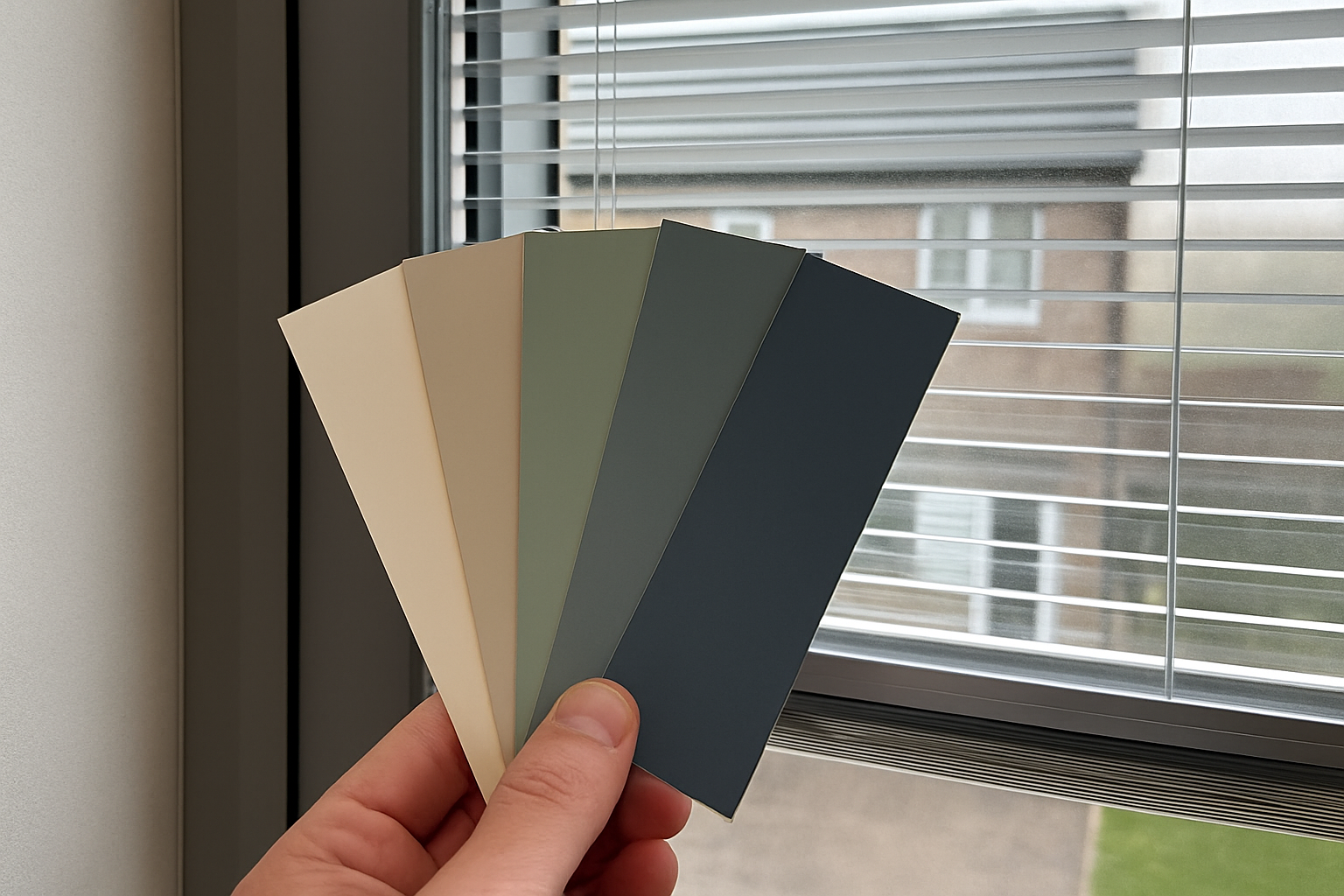
Soft, muted tones such as dove grey, beige, cream, or stone often create an elegant, versatile look and work well in a wide variety of interior styles. These shades also have long-term appeal and are less likely to feel dated over time. Consider the style of your home as well—modern, Scandinavian, rustic or traditional—as this can influence whether a matte, gloss, or metallic finish might suit your décor better.
It’s also worth considering the textures and materials in your room. For example, metallic-finish integral blinds may harmonise beautifully with chrome lighting fixtures or brushed steel handles in a contemporary kitchen. Meanwhile, wood-effect finishes might suit rustic, country-inspired interiors. If you’re also using coordinating blinds in other areas, our extensive selection like wooden blinds can create a cohesive look across separate spaces. Matching or contrasting wisely will play a huge role in the decor’s overall success.
A good practice is to obtain physical colour swatches and hold them up to your existing finishes at different times of the day. This will help you visualise how light impacts each shade and whether the selection stays true in hue. Remember, what looks stylish on a screen may not always translate correctly into real-life lighting conditions.
Accounting for Room Functionality and Lighting
Every room in your home serves a different purpose, and this should influence your colour selection. A colour perfect for a home office may not necessarily suit your relaxing bedroom or luminous kitchen.
In living rooms and lounges, people often go for greys, taupes, or warm brown tones—colours that promote relaxation and comfort. For kitchens and bathrooms, fresher colours such as soft blues, greens, or whites reflect cleanliness and calm. Bedrooms benefit from serene hues like lavender, creamy beige, or gentle earthy tones that encourage unwinding.
Different types of lighting will either amplify or dull certain colours. North-facing rooms lacking natural light might feel too cold with cool tones, so warmer shades are preferable. Conversely, south-facing rooms with ample daylight allow for a broader selection, including cooler shades that keep the room feeling balanced even under bright afternoon sun. LED and ambient bulbs can also slightly alter colour perception, so always test under your room’s typical lighting conditions before finalising your decision.
Integral blinds can also help tack on light control in areas like conservatories or full-glazed extensions. In such cases, lighter colours like warm whites or sand tones can prevent overheating while still brightening the room. Our conservatory blinds provide various solutions where light control and design must go hand in hand. For such sun-drenched environments, your colour choice should help reduce glare without sacrificing style or view.
If privacy is also a top priority—think bedrooms or ground-floor sitting areas—darker blind tones might be ideal. However, too dark a colour in a small space may feel overpowering, so careful balance with other room colours and natural light is vital. Achieving functionality without compromising style is key.
Popular Colour Trends in Integral Blinds
Keeping up with design trends can ensure your blinds feel fresh and modern for years to come. While choosing timeless shades is smart, a nod to popular colours can give your home an up-to-date and fashionable aura.
Some of the most popular current colours for integral blinds in UK interiors include:
- Stone and Putty: These earth-inspired neutrals pair beautifully with natural-toned interiors and are incredibly versatile.
- Soft Greys: A go-to in modern minimalist homes, grey adds a sense of cool sophistication without overwhelming the space.
- Anthracite: This deep, dark hue brings boldness and contrast—perfect for contemporary spaces looking to make a statement.
- Warm White: A soft alternative to brilliant white, warm white keeps spaces airy while avoiding clinical starkness.
- Muted Blues and Greens: Inspired by natural landscapes and soothing palettes, these are great for bedrooms and living rooms.
These trending shades offer a blend of visual charm and longevity, making them practical choices for homeowners who want a modern feel without committing to highly seasonal or fickle trends. Trends often stem from broader interior design movements, including nature-inspired motifs, soft Scandi elements, and rustic farmhouse aesthetics. Keep an eye out for complementary shades that don’t just follow a fad but genuinely complement your interior style and furniture layout.
Remember, following trends doesn’t mean forsaking your own style. Combine what’s fashionable with what fits your home and lifestyle. If you want a more daring touch, use trending colours on accent blinds in spaces like cloakrooms, guest bedrooms or garden rooms. This approach gives your space modern character without making a larger commitment.
Choosing Colours Based on Window Frame and Surrounds
Your window frames and surrounding architecture play a strong role in guiding the colour choice for integral blinds. The objective is to produce a seamless and visually appealing effect where the blinds do not clash with or overpower their background setting.
For white or light uPVC frames, pale shades such as off-white, cream, or light grey create a clean and uninterrupted look. This is a particularly smart choice in smaller rooms or where a subtle, less dominant appearance is desired. White-on-white combinations also lend themselves well to contemporary, minimalistic designs. In contrast, anthracite frames or dark aluminium styles pair excellently with bold colours like slate, charcoal, or even dramatic navy blue, which enhance the richness of the frame itself and give a more pronounced look.
If your frames are wooden—perhaps in a natural oak or walnut finish—a medium or dark-toned blind in coordinating hues can pick up these rich colours for a harmonious visual aesthetic. On the other hand, a high-contrast colour can draw attention to the window area, making it a feature point of the interior. This approach works well in rooms with expansive views or unique architectural details near the window zones.
The textures surrounding the window matter too. Brickwork, plaster, timber panelling or even tiling can affect how colours appear and resolve under different lighting. Soft finishes usually pair well with smooth-coloured blinds for a delicate look, whereas stark materials like metal or concrete might benefit from softened hues to create visual balance.
Don’t underestimate the importance of cohesion here. When your integral blinds blend smoothly with or tastefully contrast against your window frames and wall treatments, they elevate the entire appearance of the window. Ensuring continuity of design between frame and blind tone prevents a disjointed look, making everything feel purposefully placed.
Long-Term Appeal: Picking a Shade That Ages Well
Interior trends come and go, but your integral blinds will likely remain installed for years—so it’s wise to think about longevity in your colour choice. Avoid highly fashionable statement colours unless you’re prepared to update other aspects of your décor to accommodate them over time.
Timeless colours like white, beige, grey,