The short answer
Choose colour at the window, not on a screen or in a shop. Hold samples against the glass in daylight and again in the evening, because a blind is lit from behind by day. Pale fabrics glow and lift a room; strong colours read deeper and show fading sooner on a sunny window. Keep large patterns for flat blinds on big windows and smaller ones for romans and small rooms. Your advisor brings the full range to your home.
- A blind is lit from behind by day, so judge its colour against the glass, not the wall.
- Look at samples in daylight and again with the lamps on.
- Sunlight fades fabric, and the damage is cumulative and cannot be undone.
- Large patterns suit flat blinds and big windows; small patterns read as texture.
- Up to five free samples are posted first class, and the advisor brings the full range.
Colour at a window is lit from behind
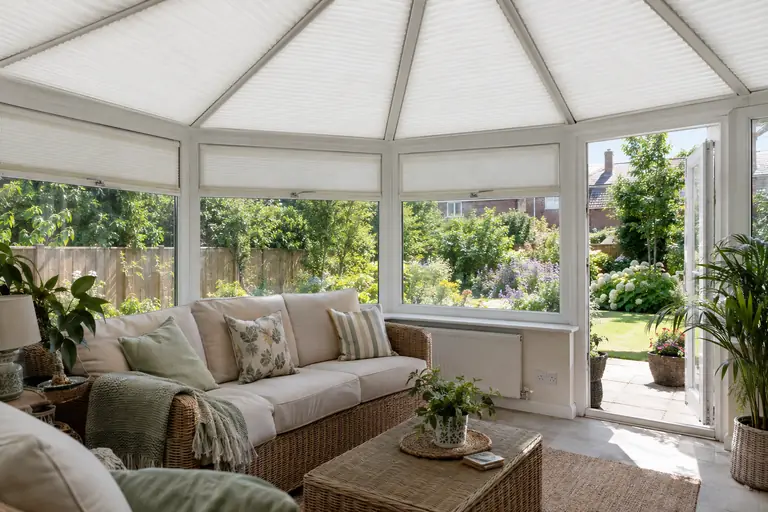
A cushion or a wall is lit from the front, by the room. A blind is lit from behind, by the sky, for most of the day. That one difference catches out more people than anything else when choosing a window fabric.
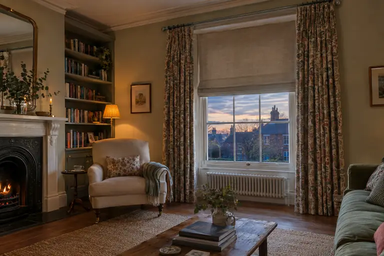
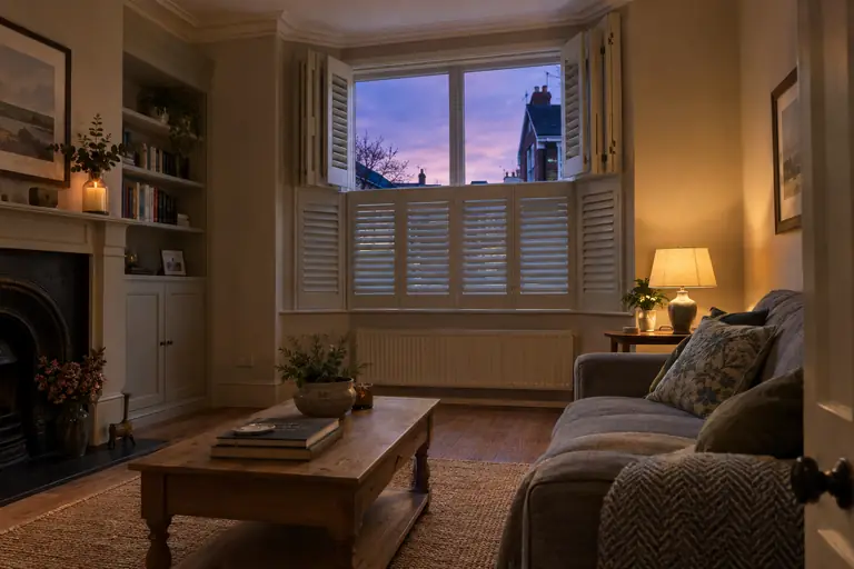
Daylight coming through a fabric changes it. It warms or cools the colour, deepens it and shows the weave. A pale linen glows; a mid grey can turn out warmer or cooler than it looked in the book; a yellow can go almost gold. Strong colours also tint the light coming into the room, so a red or orange blind half down on a sunny afternoon washes the whole room in that colour. After dark the effect reverses: the blind is lit by lamps from the front and looks much more like the sample did on the table.
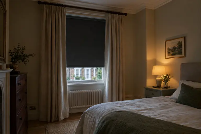
Blackout fabrics behave differently, because no light passes through them: they look much the same by day and by night, which makes them easier to judge. A dimout sits in between, with only a faint glow when the sun is behind it. Whatever the fabric, the only fair test is to hold it against the glass.
See it in your own light
Every room has its own light. A north-facing room has cool, even light all day and drains the warmth from a colour that looked warm on a phone. A south-facing room has strong, warm light that can make a pale fabric look almost white at midday. East-facing rooms are bright in the morning and flat by evening, and west-facing rooms the other way round.
Screens make this harder, because every screen renders colour its own way. Treat the pictures online as a guide to the pattern and the style rather than the exact shade.
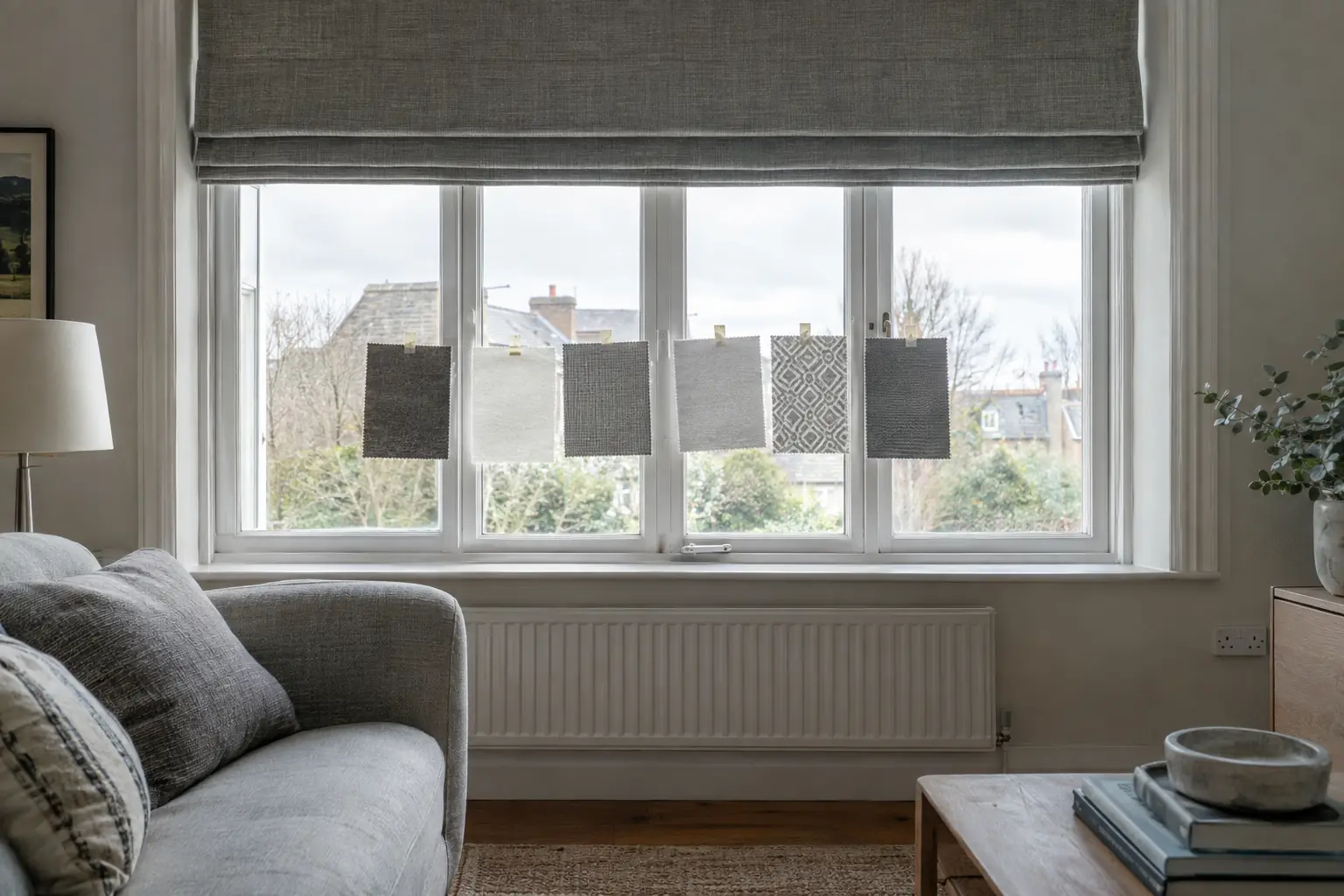
That is why we post swatches. You can order up to five free samples, sent first class, and five is an easier number to judge than twenty. Tape them to the glass and look at them in the morning, at midday and with the lamps on, from across the room as well as up close. Better still, book a home appointment, where your advisor holds fabrics from the whole range against your own windows, in your own light, so you can see the whole choice in the room it is for.
Sunlight and fading
Every fabric at a window lives in the sun, and sunlight changes it. The National Trust, which cares for historic textiles, notes that light from a window fades and damages materials, that textiles fade and disintegrate, and that the damage is cumulative and irreversible. Ultraviolet light, which you cannot see, does the most damage, according to Museums Galleries Scotland, and the Institute of Conservation puts it plainly: every kind of textile is easily harmed by light, and silk suffers most.
For a blind or a curtain, that has a few practical consequences. Strong, saturated colours on a south- or west-facing window show fading sooner than pale ones, simply because the change is easier to see. Some coloured blind fabrics can fade over time themselves, which museum guidance notes too. And a lined curtain protects its face fabric, because the lining takes the sun first.
The other side is what a blind protects. At the National Trust, blinds are used on bright days to keep the sun's damaging rays off the collections, and a blind lowered on a sunny afternoon does a similar job for a sofa, a rug or a wooden floor.
Greys, whites and the popular neutrals
Greys and whites are the most chosen window colours for good reasons: they suit most rooms, sit quietly against most walls and let the rest of the room do the talking. They are also harder to choose well than they look.
Greys vary more than any other colour. A grey with a touch of blue or green reads cool and crisp in a south-facing room but can feel cold in a north-facing one; a grey with warmth in it, closer to stone or taupe, holds up better in cool light. Hold the sample against the window frame and the wall together, because a grey that matches the paint chart may still clash with the carpet.
Whites are the same story in a smaller range. Bright white suits new white uPVC frames and modern rooms; off-whites and creams suit older painted woodwork, which has usually yellowed a little, and stone or cream walls. Side by side, the wrong white looks either blue or grubby. In a kitchen or a hallway, a very pale fabric shows marks sooner, so choose a wipeable one where it matters.
Pattern and scale
How a pattern looks depends on the size of the window and the type of dressing.
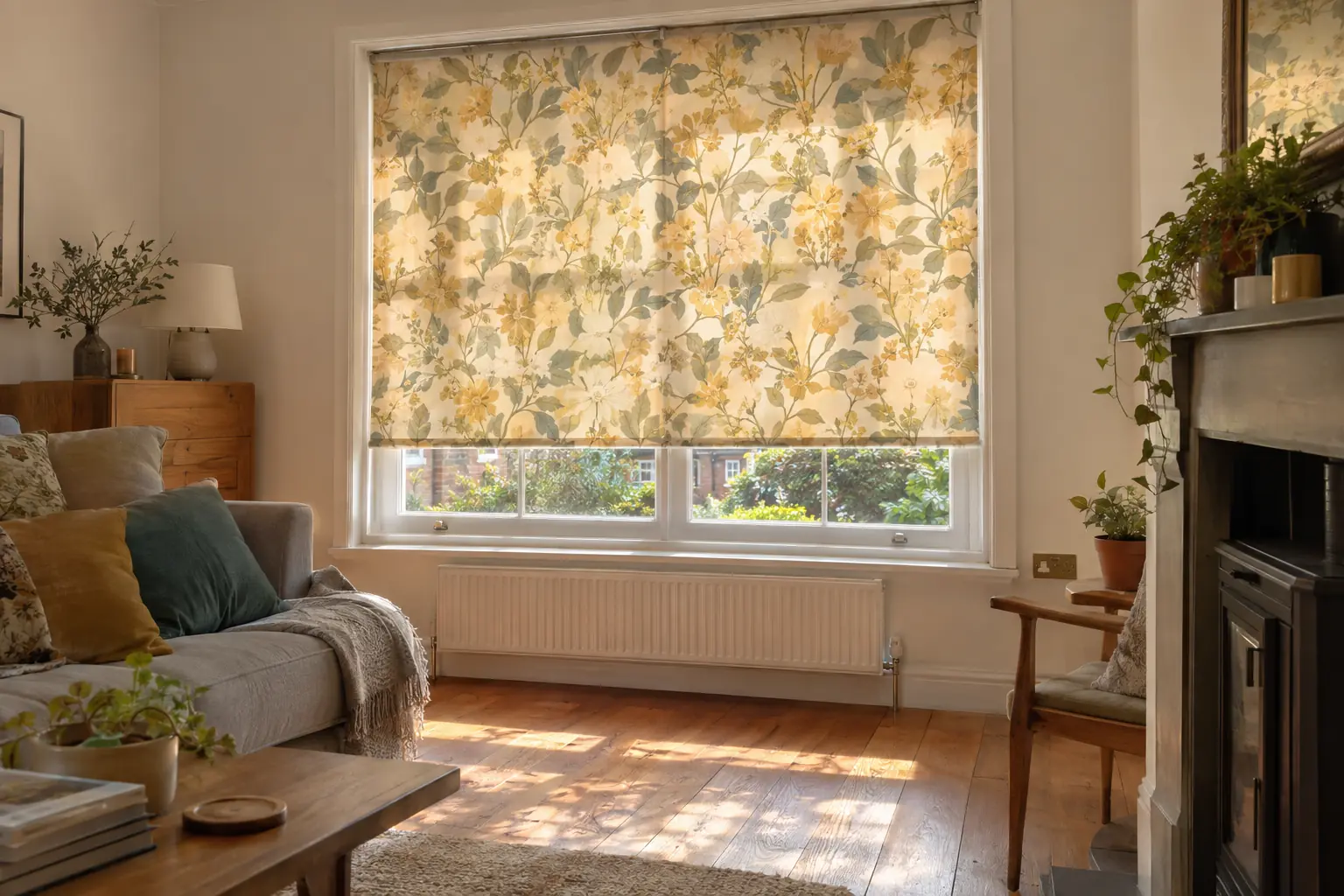
A roller blind shows its fabric flat, so the whole pattern is visible at once when it is down. That makes it the best way to show a large-scale print, and it suits bold geometrics and big florals on a generous window. On a small window, the same print is cropped to a fragment and can look like an accident.
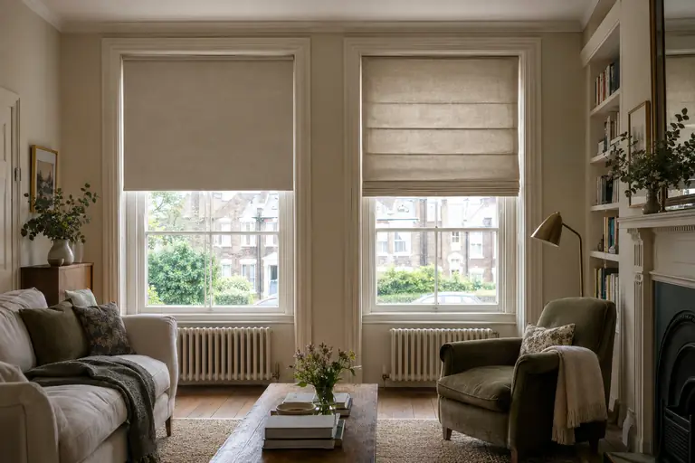
A roman blind folds as it rises, cutting the pattern into horizontal bands and hiding some of it in the folds at the top. Small and medium patterns, stripes and simple geometrics suit romans well; a large motif may end up split across a fold. Curtains gather into folds, which breaks up a pattern further and softens it, so a busy print that would overwhelm as a flat blind can work well as a curtain.
Small-scale patterns read as texture from across the room and are the easiest to live with. Before you choose, stand where you normally sit and look at the sample from there, not from arm's length.
Florals, geometrics and where they work
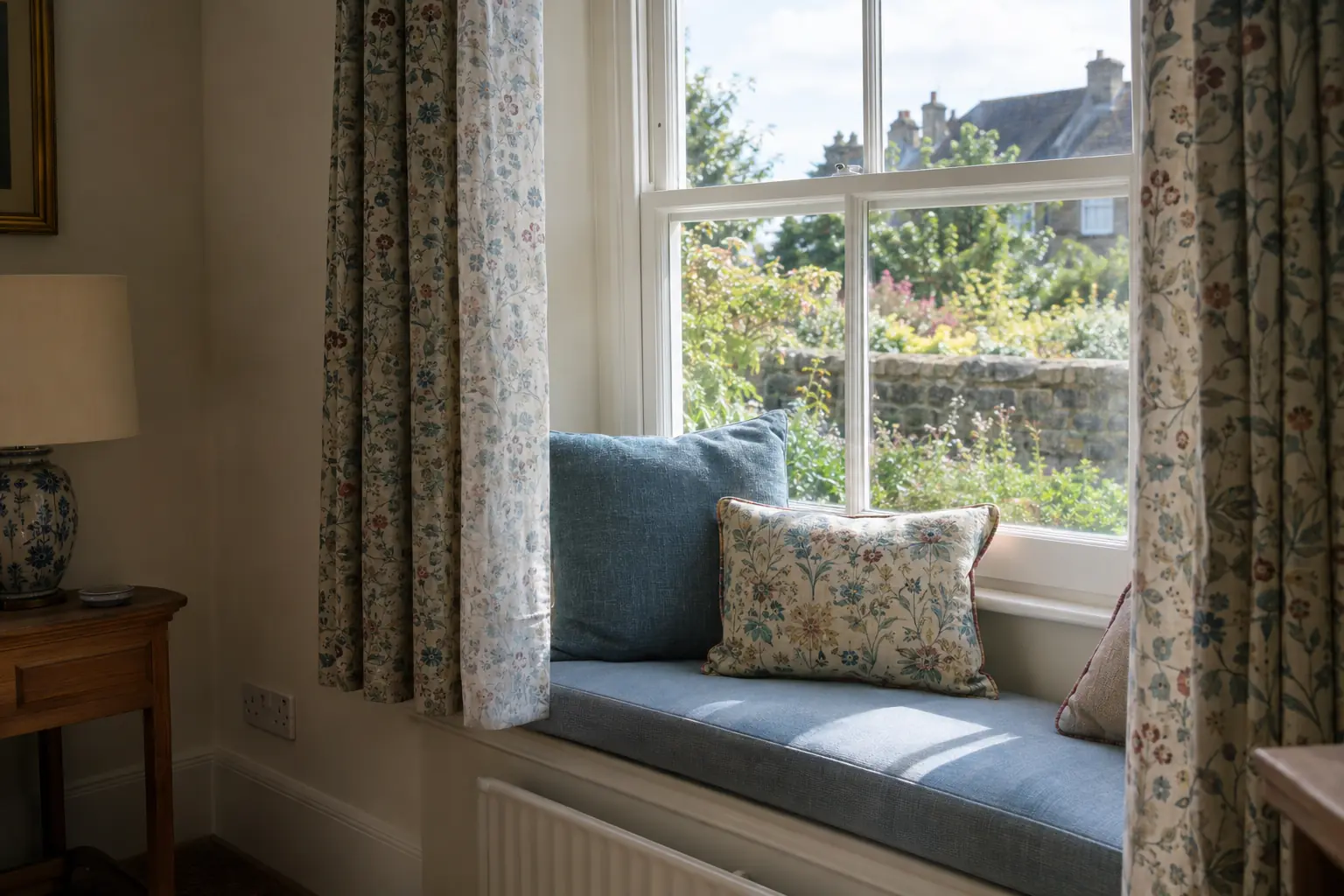
Florals bring softness and movement to a window. They suit bedrooms, cottage kitchens and sitting rooms where the rest of the scheme is fairly plain, and they work best when one colour from the flowers is picked up elsewhere, on a cushion, a rug or a painted wall, so the window looks connected to the room rather than stuck onto it.
Geometrics are crisper. Stripes, grids and repeating shapes suit modern rooms, studies and children's rooms, and a vertical stripe on a curtain can make a low window feel taller. They are less forgiving of an out-of-square window, though, because a straight line beside a sloping reveal draws attention to the slope. On an older house, a softer pattern can be kinder.
In both cases, one pattern per sightline is a good rule. A patterned blind with plain walls, or a patterned curtain against a plain room, lets the pattern breathe. Two patterns can work together if they share a colour and differ in scale, but the safe first move is to let one lead.
What the street sees
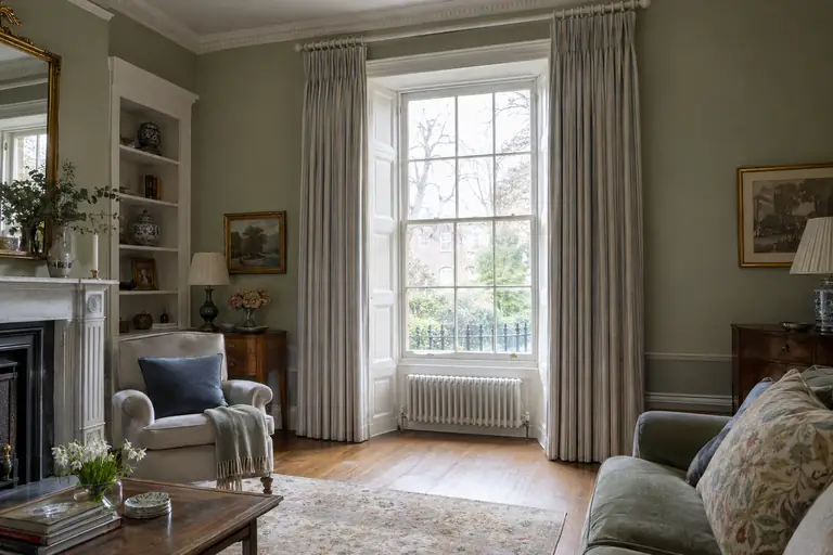
From outside, every window shows the back of its blind or the lining of its curtains, and at night that back is lit up by the room. A house with a different colour in every front window can look busy from the pavement even when each room looks right inside.
The usual answer is to keep the side the street sees consistent across the front of the house, and let each room go its own way inside. Lined curtains help twice over: the lining gives the street a calm, even view, and it protects the face fabric from the sun.
For blinds, turn each sample over and look at the back as well as the front, then hold it up to the light. A patterned blind can show its pattern through to the outside when the sun is behind it, and a blackout fabric usually looks quite different on the reverse. Your advisor can tell you what each fabric looks like from outside before you choose.
Checklist
- Note which way each window faces and when you use the room.
- Order up to five samples, not a whole collection.
- Tape samples to the glass and look at them in the morning, at midday and in the evening.
- Check greys and whites against the window frame and the woodwork, not just the wall.
- Keep strong colours and silks off the sunniest windows, or line them.
- Match the pattern scale to the window: big prints on big, flat blinds.
- Look at the back of each fabric, because that is what the street sees.